Understanding Indian User Behaviour for Filter & Category Pages
India is a land of incredible diversity, not just in cultures and languages, but also in how people use digital platforms. When designing filter and category pages for Indian users, it’s important to recognize the wide range of user behaviours across different regions and communities. Indians access websites and apps using a mix of languages such as Hindi, English, Tamil, Telugu, Bengali, Marathi, and more. This multilingual landscape means that responsive design should accommodate regional language preferences for better engagement.
Device diversity is another key factor. Many Indians use mobile phones as their primary device for browsing, but there’s also significant traffic from affordable tablets and shared family desktops. Your filter and category pages must be optimized for small screens, touch navigation, slow internet speeds, and sometimes older browsers or devices.
Cultural nuances play a big role too. For example, festive shopping spikes during Diwali or Eid, and product categories like ethnic wear or puja items become highly relevant. Understanding these patterns helps in prioritizing filters (like price ranges in INR or region-specific brands) that resonate with Indian shoppers. By considering these behaviours, you’ll build filter and category pages that feel intuitive and familiar to users across India’s vast digital landscape.
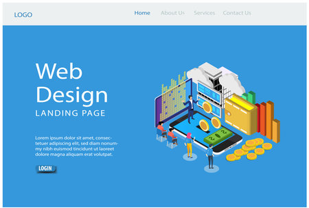
Mobile-First Responsive Design for Indias Device Landscape
India is a mobile-first nation, with the majority of users accessing e-commerce and content platforms through smartphones. Understanding this trend is critical for designing filter and category pages that deliver a seamless user experience across all devices, especially mobiles. This section will explore why focusing on mobile users is essential and how to structure your pages for India’s unique digital environment.
Why Mobile-First Matters in India
According to recent data, over 75% of India’s internet traffic comes from mobile devices. This means that if your filter and category pages are not optimised for smartphones, you risk losing a large chunk of your audience. With affordable data plans and widespread smartphone adoption—even in Tier 2 and Tier 3 cities—mobile accessibility must be at the heart of your design strategy.
Key Benefits of Mobile-First Approach
| Benefit | How it Helps Indian Users |
|---|---|
| Faster Load Times | Reduces data consumption, crucial for users with limited plans or patchy connectivity. |
| Simplified Navigation | Makes it easy for first-time internet users to find products/categories quickly. |
| Improved Accessibility | Caters to diverse linguistic backgrounds and varying digital skills. |
Prioritising Content & Filters for Mobile Users
To create powerful responsive filter and category pages, it’s vital to prioritise what matters most to your Indian audience:
- Show Most Relevant Filters First: Display top-used filters such as price range, brands, and product ratings upfront. In India, affordability is often a key factor in purchase decisions.
- Sticky Filter Bar: Implement a sticky filter bar at the top or bottom so users can access filters easily without endless scrolling.
- Categorise Wisely: Use local terms (e.g., “Kurtas” instead of just “Dresses”) and regional language support to enhance usability for vernacular audiences.
Example: Prioritisation Table for Mobile Filters
| Priority Level | Filter Type |
|---|---|
| High | Price, Brand, Rating |
| Medium | Discounts, Availability (COD/Free Delivery) |
| Low | Colour, Size (apparel specific) |
By adopting a mobile-first mindset and structuring your filter & category pages according to real user needs in India, you ensure smoother browsing experiences and higher conversions across all devices.
3. Customising Local Language and Content
Tips for Integrating Regional Languages
India is a land of diverse languages, with over 20 official languages and hundreds of dialects. To make your filter and category pages truly responsive and inclusive, it’s crucial to offer content in popular regional languages such as Hindi, Tamil, Telugu, Bengali, and Marathi. This can be achieved by:
Use Language Toggle Options
Integrate an easy-to-spot language switcher at the top of your category or filter pages. Make sure the toggle icons use local scripts (e.g., हिंदी for Hindi) so users can quickly find their preferred language.
Auto-Detect & Suggest Local Languages
Leverage browser or device settings to detect a user’s preferred language and suggest switching to it. For example, if someone’s device is set to Tamil, prompt them with “View this page in தமிழ்?” for a seamless experience.
Consistent Terminology
Work with native speakers to ensure that filtering options and categories are translated accurately. Use commonly understood words rather than literal translations—what works in Mumbai might not be the same in Chennai!
Tailoring Content for India’s Cultural Calendar
India’s vibrant festival calendar—Diwali, Eid, Pongal, Christmas, Holi, Onam—shapes shopping patterns and user interests throughout the year. Responsive design isn’t just about layouts; it’s about contextually relevant content too.
Dynamic Festival Themes
Update category banners and filter highlights with festive themes relevant to each region (for instance, Karthigai Deepam offers in Tamil Nadu or Ganesh Chaturthi specials in Maharashtra). Use local symbols and greetings in banners to add a personal touch.
Localized Promotions & Filters
Create special filters during festivals (“Diwali Offers”, “Eid Specials”) and display products that match local traditions (like sarees for Durga Puja or sweets for Raksha Bandhan). This enhances user engagement across different states.
Pro Tip: Mobile-First Cultural Adaptation
Given India’s high mobile usage, ensure all language toggles and festival banners are easily tappable on smaller screens without cluttering the UI. Use collapsible sections for long lists of regional categories or filters so users aren’t overwhelmed.
By customising both language and content to match local preferences and cultural moments, you’ll build trust and loyalty among India’s diverse online shoppers—making your filter & category pages more powerful across every device.
4. Effective Filter Placement and Usability
Smart Filter Positioning for Indian Users
When designing filter and category pages for the Indian market, strategic filter placement is key to ensuring a smooth browsing experience across all devices. In India, users often access e-commerce or content platforms via smartphones with varying screen sizes, so it is crucial to keep filters both accessible and unobtrusive. Placing filters at the top of the page (horizontal layout) works well for mobiles, while a collapsible side panel (vertical layout) suits desktop users. For tablets, hybrid approaches—like a dropdown menu—are popular.
Best Practices: Positioning Filters Across Devices
| Device Type | Recommended Filter Placement | Reason |
|---|---|---|
| Mobile | Top bar or floating button | Maximizes screen space; quick thumb access |
| Tablet | Dropdown or expandable sidebar | Adapts to landscape/portrait modes |
| Desktop | Left-side vertical panel | Makes multiple options visible without scrolling |
Familiar Icons and Local Relevance
Indians are familiar with certain universal icons like funnel (for filters), tick marks (for selection), and cross marks (to clear). However, consider adding locally understood cues—such as Hindi labels or regional language tooltips—especially if your platform caters to Tier 2 and Tier 3 cities. Using recognisable icons speeds up navigation and reduces confusion for first-time shoppers.
Examples of Popular Filter Icons in India:
- Funnel icon: Used by Flipkart & Myntra for “Filter” action
- Tune icon: Seen on Amazon India’s mobile apps
- Clear All button: Often labelled in English and Hindi (“साफ़ करें”)
Ensuring Intuitive Navigation Patterns
Indian users expect quick, easy-to-understand navigation. Sticky filter bars help users refine results without scrolling back up. Accordion-style filters reduce clutter, especially on mobiles. Always provide an obvious “Apply” button—preferably in a bright colour—and instant feedback when selections are changed. Allow users to see active filters at a glance and remove them with one tap or click.
User Experience Tips for Indian Browsers:
- Keep most-used filters (price, brand, rating) at the top.
- Add “Sort By” options near filters for convenience.
- Offer multi-language support on filter labels where possible.
- Avoid hidden menus; make all filter options discoverable within two taps/clicks.
By carefully positioning filters, using familiar visual cues, and following intuitive navigation practices tailored to Indian browsing behaviour, you can create responsive filter & category pages that engage users and boost conversions across all devices.
5. Optimising Performance for Diverse Indian Networks
Understanding the Connectivity Challenge
India is a diverse country, and internet connectivity varies widely from metro cities like Mumbai and Bengaluru to smaller towns and rural areas. For filter and category pages to deliver a seamless experience across all devices, you must address performance for users on both high-speed 5G and slower 2G or 3G networks.
Strategies to Reduce Page Load Time
Minimise HTTP Requests
Each extra file (like CSS, JS, images) increases loading time. Combine files wherever possible and use minified code. This is especially important for Indian users browsing on mobile data packs or limited connectivity.
Enable Lazy Loading
Lazy loading defers the loading of images and content until they are needed (for example, as users scroll). This means your filter and category pages load faster initially, giving a better first impression to users in regions with patchy networks like North-East India or remote villages.
Optimise Images for All Devices
Use WebP Format
The WebP format gives you smaller file sizes without losing image quality—ideal for Indian e-commerce, grocery, or news websites targeting mobile-first audiences.
Responsive Image Sizing
Serve appropriately sized images based on device type. For example, a shopper in Delhi using a budget smartphone should not download large desktop-sized images when browsing sarees or mobile accessories.
Adopt Lightweight Design Principles
Simplify Layouts
Avoid heavy graphics or complex animations. Use flat icons, simple colour schemes, and clear CTAs that load quickly even on entry-level devices popular in India like Redmi or Realme phones.
Leverage Local Caching
Caching static assets ensures repeat visitors from places like Patna or Bhopal experience lightning-fast load times—even with intermittent network access.
Key Takeaway for Indian Audiences
By focusing on fast page loads, optimised images, and lightweight layouts, you ensure that everyone—from a college student in Chennai to a farmer in Punjab—enjoys easy access to your filter & category pages regardless of their network speed or device type.
6. Accessibility and Inclusivity in the Indian Context
Designing for Diverse Abilities and Needs
When creating filter and category pages for the Indian market, it is essential to ensure that your design is accessible to everyone, including differently-abled users. India’s population is highly diverse, with varying levels of physical abilities and digital literacy. Responsive designs must go beyond just screen size adaptation; they should also provide smooth navigation for people using assistive technologies such as screen readers or keyboard-only navigation.
Meeting Local Accessibility Standards
Follow local guidelines like the Government of India’s GIGW (Guidelines for Indian Government Websites) and global standards such as WCAG (Web Content Accessibility Guidelines). Use high-contrast colours for better visibility, clear font choices, and ensure text can be resized without breaking layouts. Include alt text for images, logical heading structures, and sufficient clickable areas for touch devices common in India.
Accommodating Digital Literacy Levels
India has a vast user base with different levels of comfort with technology. Keep filter and category interfaces simple, with intuitive icons (like checkmarks or toggles), straightforward language, and visible helper text in regional languages where possible. Provide tooltips or short explainer videos in popular Indian languages to guide first-time users through the filtering process.
Key Takeaway
An inclusive responsive design not only opens your platform to more users but also builds trust among India’s digitally evolving audience. Prioritise accessibility at every step so that your filter and category pages serve all users efficiently—regardless of device, ability, or familiarity with technology.